Graphical components
Currently, Built Stock Explorer has two graphical components that are nested under the "Plot" tab: "Datacube" and "Distplot". They contain a collection of instruments for multi- and univariate analysis accordingly.
Datacube
Datacube (Fig. 2) is a 3-dimensional plot used to study the relationship between the six available variables. By default, three numerical variables are used as the dimensions of the cube. Adding one or two categorical variable(s) will project the data on the hyperplane: 2-dimensional (plane) or 1-dimensional (line) respectively. The same numerical variable selected for both X- and Y-axis, creates a 2-dimensional plane, passing diagonally through the X-Y space. The choice of the variable for Z-dimension is limited to either "Energy use" or "Energy intensity". Log scale, if active, applies to all numerical variables except "Construction year". Datacube has the instruments for clustering and regression modelling as explained below.
Clustering
Datacube displays cluster centroids obtained using k-means clustering on the selected data subset. This unsupervised machine learning method seeks an optimal division of the subset into k clusters, with each building assumed to belong to the closest one. Cluster centroids, therefore, generalise the properties of larger groups of buildings. In Built Stock Explorer, k-means clustering is carried out per city per building type based on three numerical variables (construction year, heated floor area and energy use) for the number of clusters [1 ≤ k ≤ 25]. Standard feature scaling (to zero-mean and unit-variance) is applied automatically prior to clustering, and the resulting centroids are automatically reverse-scaled. The size of the cluster centroid is proportional to the number of certified units assigned to the cluster. A hover-box shows the values of the selected variables for the cluster centroid and the number of units that are assigned to it (as illustrated in Fig. 2).
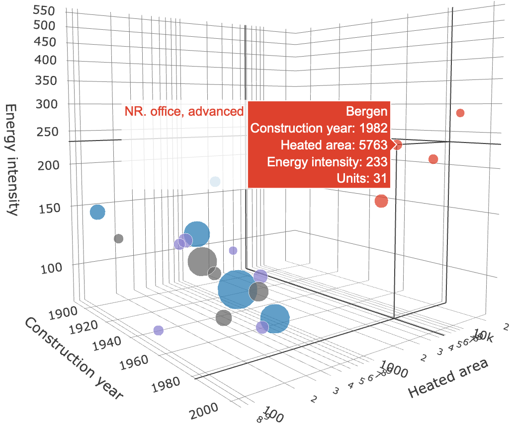
Fig. 2 illustrates cluster centroids found for four distinct building types (highlighted with distinct colours) in Bergen. The advanced offices are clustered around four visible centroids (illustrated in red) that generalise/represent the size, age and energy use of the units belonging to these clusters. The coordinates of the centroids define archetype/representative units and may be used to model advanced offices in Bergen. The cluster that the cursor points to has 31 units assigned to it, with the mean construction year: 1982, mean heated floor area of 5763 m2 and mean energy intensity of 233 kWh·y-1·m-2.
NB:
- The centroids of the clusters that have 3 or fewer units are not shown (a data confidentiality measure).
- A new set of clusters is computed every time the user updates the subset or the number of clusters.
Regression modelling
Datacube can fit and display multiple linear regression models per city per building type within the selected subset. These models have a form:
where Z is the selected variable for the Z-axis, either total annual energy use (EU, kWh·y-1) or energy intensity (EI, kWh·y-1·m-2). CY and HFA are the construction year and heated floor area () accordingly. The intercept a0 and slope coefficients a1, a2 are found through the ordinary least squares method. For each point within the input space of construction year and heated floor area, the output can be predicted using this model. A set of these outputs forms a surface that is displayed (Fig. 3). A hover-box shows the values of the selected independent variables, the model and the model's prediction through the entire input space.
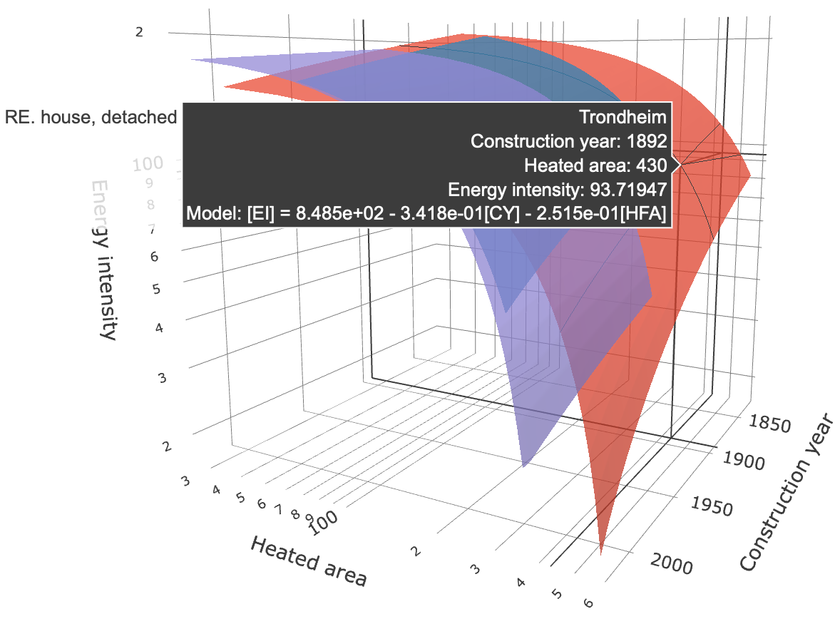
Fig. 3 illustrates three regression models that may be used to predict energy intensity given the construction year and the heated floor area (m2) for three distinct building types in Trondheim. The surface that the cursor is pointing to is associated with detached houses, for which energy intensity is governed by the model:
Slope coefficient has a negative value, thus suggesting that the energy intensity inversely depends on construction year, i.e. the newer the building - the smaller the energy intensity. One of the reasons for observing this tendency is the improvement of energy efficiency standards during recent years. Also, larger houses typically utilise energy more efficiently compared to smaller ones. This explains why the heated floor area also has a negative slope coefficient (). Using this model, a detached house of 430 m2 HFA constructed in 1892 in Trondheim is expected to have an energy intensity of 93.72 kWh·y-1·m-2 (as shown in the hover-box in Fig. 3).
The fitted model can be used in the computational environment of choice to obtain the prediction given any pair (construction year : heated floor area). With python, for example, the energy intensity of a detached house constructed in 1975 in Trondheim having 200 m2 can be predicted as follows:
Or, through a python function:
>>> def predict_ei(cy,hfa):

    # Predict EI based on CY and HFA of a detaches house in Trondheim

    return 848.5 - 0.3418*cy - 0.2515*hfa

# Call a function with CY and HFA as arguments
>>> predict_ei(1975, 200)
123.145
# Or use numpy arrays as CY and HFA arguments to do the same for many units at once
>>> import numpy as np
>>> predict_ei(np.array([1975,2002]), np.array([200, 401]))
array([123.145,  63.421])
>>>
Distplot
Distplot is a histogram used to examine the selected variable in detail and consists in finding/documenting how likely are certain values to occur through the entire range of possible values. This is done based on the available subset and may be further projected on the buildings for which there is no information available. Built Stock Explorer supports these tasks through several features elaborated below.
Density and cumulative density histograms
In Distplot, the distribution of values taken by the variable can be visualised as a histogram of either density (Fig. 4) or cumulative density (Fig. 5).
A density histogram displays the relative likelihood of a certain range of values to occur, whereas the cumulative density histogram indicates the probability of obtaining a value below a certain threshold. The number () of bins evenly spaced through the entire range of values is controlled through a slider. For the histogram to be shown - a "Histogram" checkbox must be active. The histograms are shown per city per building type. A hover-box shows the value that the variable has in the selected bin, the density (or cumulative density) and the total number of records in the selected subset.
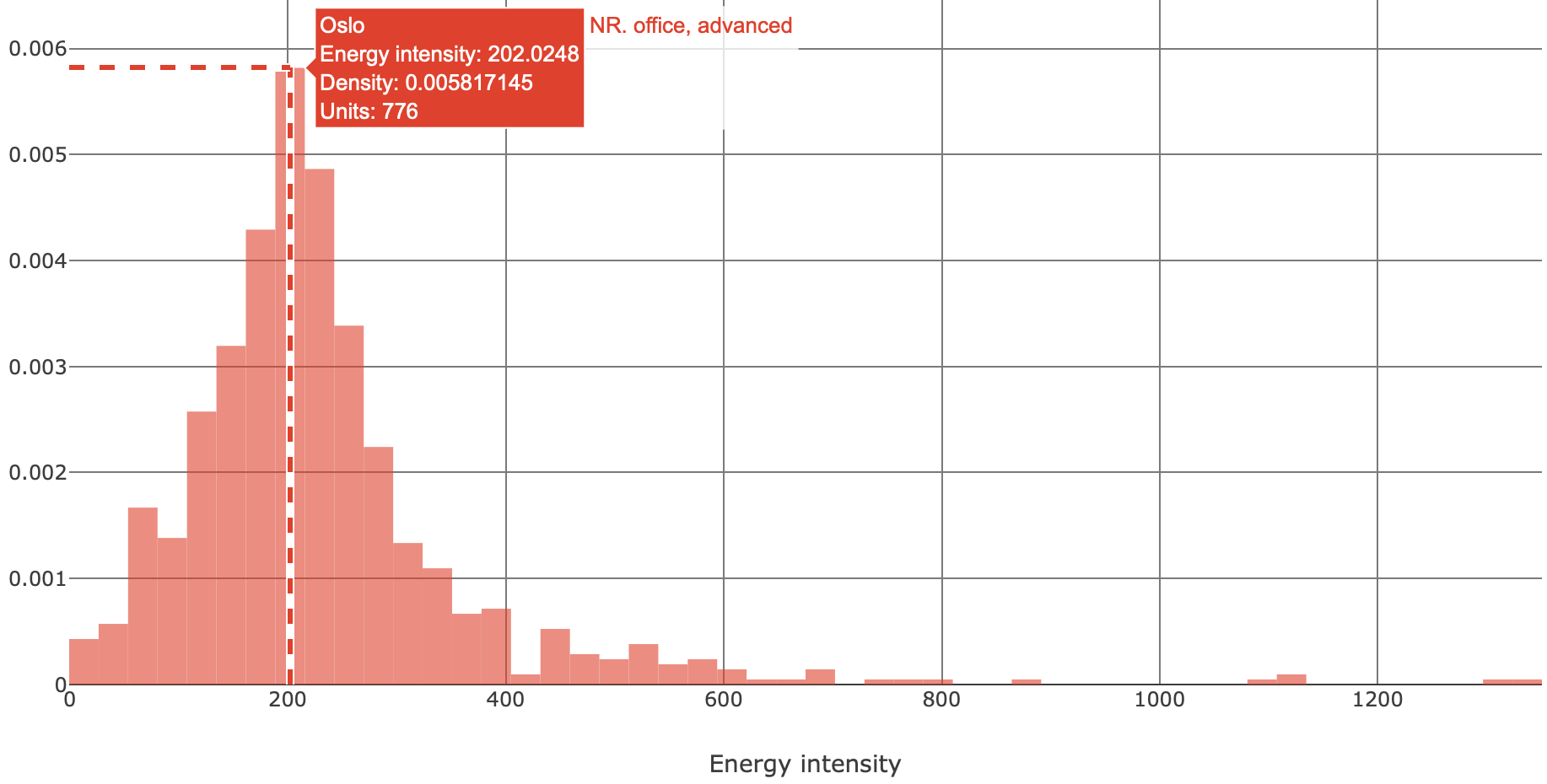
Fig. 4 illustrates a density histogram of energy intensity (kWh·y-1·m-2) of advanced offices in Oslo. The subset consists of 776 records in the range [0...1300] kWh·y-1·m-2. A peak of density is at 202 kWh·y-1·m-2, which is the most common value. Values above 600 kWh·y-1·m-2 have low density, thus suggesting that the advanced offices with such high energy intensity are rather uncommon in Oslo.
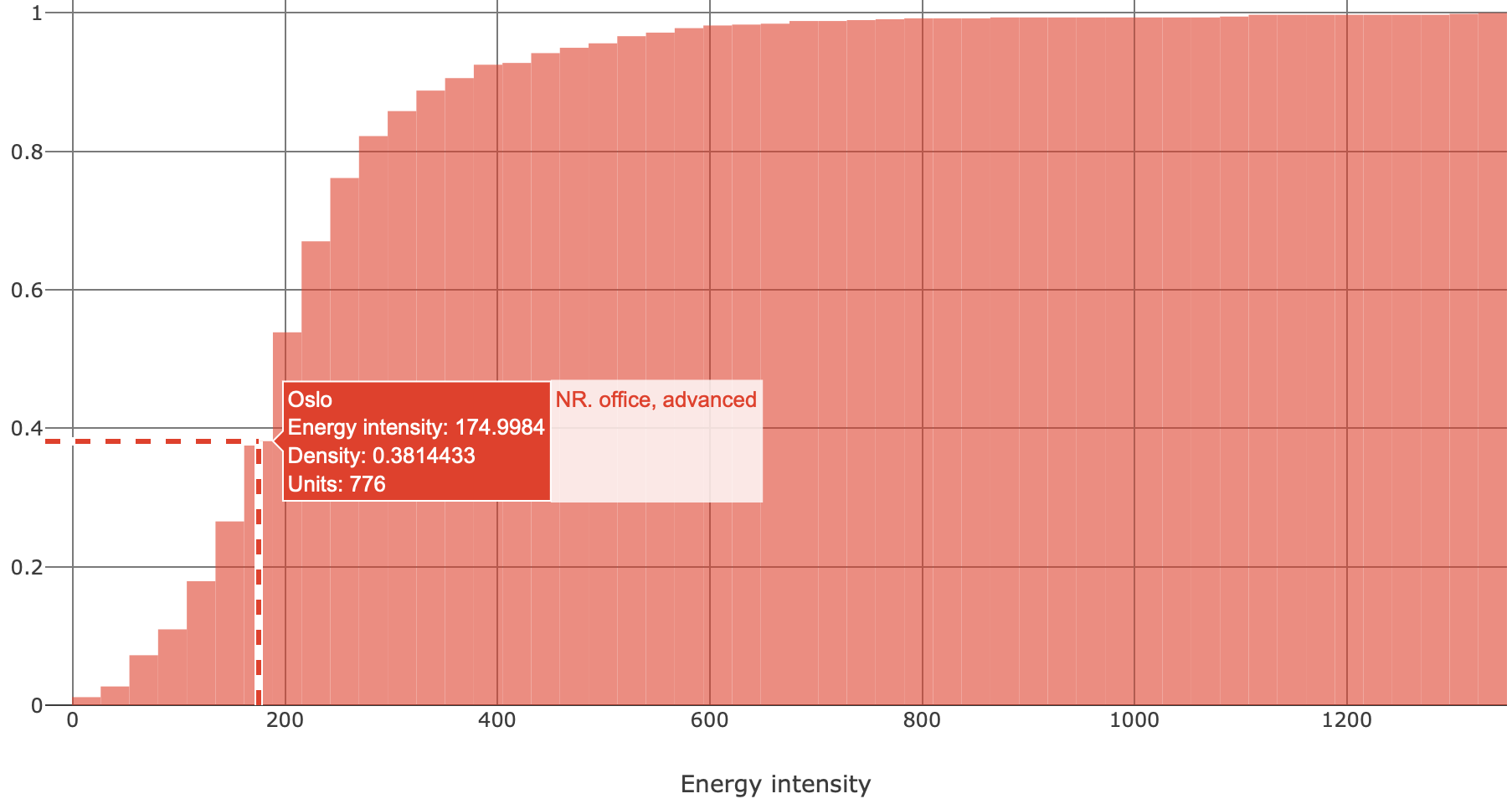
Fig. 5 illustrates a cumulative density histogram for the subset shown in Fig. 4. A hover-box suggests that there is 0.381 (or 38.1%) chance that the randomly picked advanced office in Oslo will have energy intensity of 175 kWh·y-1·m-2 or less.
NB:
- Five or more records are needed for the histogram to be shown.
- The number of bins must be smaller than the number of records in the subset.
Sample statistics
Several sample statstics (Fig. 6) can be computed and shown on top of either density or cumulative density histogram. These are:
- mean (average) of values;
- mode (peak of density);
- 1st, 2nd (median) and 3rd quartiles.
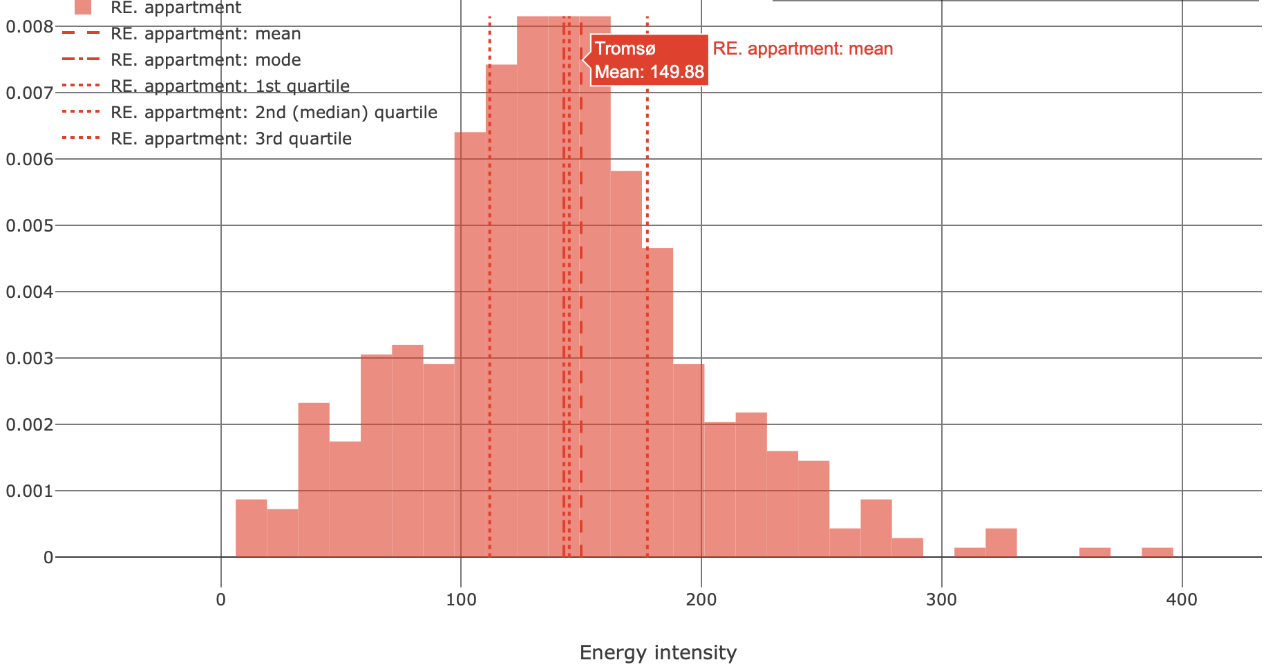
Fig. 6 shows the sample statistics computed for the energy intensity (kWh·y-1·m-2) for apartments constructed in Tromsø between 1976 and 2020. This subset is associated with a rather symmetric distribution where the mean, mode and median are close to 150 kWh·y-1·m-2. 50% of records are being observed within a rather narrow range between the 1st and the 3rd quartile (112 and 177 kWh·y-1·m-2 accordingly).
Univariate density estimation
The objective of parametric univariate density estimation is to find which type and parameters of the theoretical distribution describe the data. This is necessary to simulate a larger number of buildings distributed similarly to what is seen in the available data. Built Stock Explorer enables to fit, evaluate the goodness-of-fit and display the theoretical distributions for any subset (e.g. Fig. 7). A list of 95 theoretical distributions is available:
'alpha', 'anglit', 'arcsine', 'argus', 'beta', 'betaprime', 'bradford', 'burr', 'burr12', 'cauchy', 'chi', 'chi2', 'cosine', 'crystalball', 'dgamma', 'dweibull', 'erlang', 'expon', 'exponnorm', 'exponweib', 'exponpow', 'f', 'fatiguelife', 'fisk', 'foldcauchy', 'foldnorm', 'genlogistic', 'gennorm', 'genpareto', 'genexpon', 'genextreme', 'gausshyper', 'gamma', 'gengamma', 'genhalflogistic', 'gilbrat', 'gompertz', 'gumbel_r', 'gumbel_l', 'halfcauchy', 'halflogistic', 'halfnorm', 'halfgennorm', 'hypsecant', 'invgamma', 'invgauss', 'invweibull', 'johnsonsb', 'johnsonsu', 'kappa4', 'kappa3', 'ksone', 'kstwobign', 'laplace', 'levy', 'levy_l', 'logistic', 'loggamma', 'loglaplace', 'lognorm', 'lomax', 'maxwell', 'mielke', 'moyal', 'nakagami', 'ncx2', 'ncf', 'nct', 'norm', 'norminvgauss', 'pareto', 'pearson3', 'powerlaw', 'powerlognorm', 'powernorm', 'rdist', 'reciprocal', 'rayleigh', 'rice', 'recipinvgauss', 'semicircular', 'skewnorm', 't', 'trapz', 'triang', 'truncexpon', 'truncnorm', 'tukeylambda', 'uniform', 'vonmises', 'vonmises_line', 'wald', 'weibull_min', 'weibull_max', 'wrapcauchy'
This list of distributions and their naming conventions is consistent with and relies on scipy.stats. Fitting is carried out using the maximum likelihood estimation (MLE) method. Goodness-of-fit of the theoretical distribution may be judged by examining how close its probability density function (PDF) or the cumulative distribution function (CDF) follows the density or cumulative density histograms accordingly of the subset. Also, a quantitative metric for goodness-of-fit based on the (two-sided) Kolmogorov–Smirnov test is implemented in Built Stock Explorer. The test computes D-statistic and p-value. D-statistic is the largest absolute difference between the CDF of the fitted theoretical distribution and the empirical cumulative distribution function of the subset. Smaller D-statistic suggests a better fit. The p-value is a measure of how likely is it to observe D-statistic that large if the data does in fact follow the fitted distribution. Practically, a p-value larger than 0.05 suggests a good fit. The "Function" checkbox must be active for the distribution(s) to be shown on the histogram. A hover-box shows the value of the variable, the corresponding density, name and parameters of the theoretical distribution, D-statistic and p-value associated with the fit. Parameters of the distribution are listed in the format [p_1, p_2,...p_n, loc, scale], where [p_1, p_2,...p_n] are the shape parameters, if any. Location and scale parameters are always placed in the two last positions.
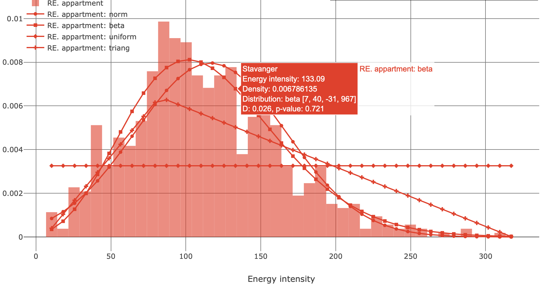
Fig. 7 illustrates the density histogram and the PDFs of several distributions fitted to the subset of apartments in Stavanger. It is shown that beta and normal distributions are associated with a better fit compared to triangular and uniform distributions. The hover-box suggest that beta distribution with parameters [7, 40, -31, 967] has a small D-statistic and a large p-value. The energy intensity of a larger number of apartments in Stavanger can be simulated as a random variable that follows beta [7, 40, -31, 967] distribution. With python and scipy, this may be done as follows:
# Simulate 10000 apartments given the parameterised theoretical distribution
>>> from scipy.stats import beta
>>> r = beta.rvs(7, 40, -31, 967, size=10000)
>>> r
array([ 84.3377058, 93.90328628, 153.86908053, ..., 45.10635533, 88.0250997, 194.9165163 ])
# Illustrate the simulated results using a density histogram in matplotlib
>>> import matplotlib.pyplot as plt
>>> plt.figure()
>>> plt.hist(r, bins=50, density=True)
>>> plt.show()
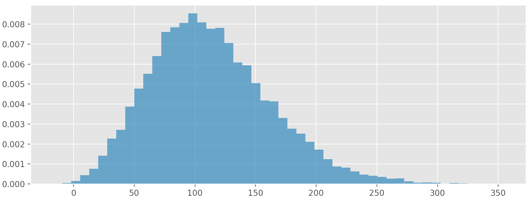
As expected, the histogram in Fig. 8 looks similar to the one that the inference is done upon (Fig. 7). Accurately replicating the distribution of the data through pseudo-random numbers is the basis of modelling/simulating built stock by means of probabilistic programming.